Any fan of American metal masters Slipknot will know of their cornucopia of creepy and vivid imagery. Each era of theirs has had a distinct artistic feel: from the “carnival of horrors” imagery of their debut album and the goat motifs starting from ‘Iowa’, to their grisly interpretations of death and hell in their latest release ‘.5: The Gray Chapter’. Spearheaded by the demented mind of percussionist M Shawn “Clown” Crahan, Slipknot are now known as much for their visual identity as their balls-out brutal music.
Well, one of the Indian metal scene’s very own has added his little piece of art to the band’s legacy. Enter, Reuben Bhattacharya.
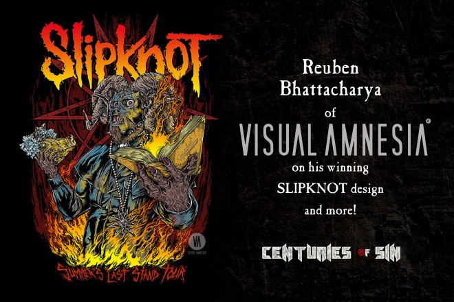
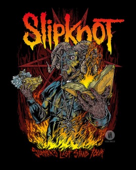
Known as both the bassist of Delhi extreme metallers Undying Inc and the art and brand designing entity Visual Amnesia, Reuben is one of the Indian music scene’s go-to guys for album and concert artworks. However, his profile was taken to a whole new level a few months ago, when his was the winning entry in the “Design a T-shirt for Slipknot” competition by Creative Allies. Reuben’s art is now set to appear on the t-shirts for the band’s latest ‘Summer’s Last Stand’ tour as well as their Knotfest festival.
Centuries of Sin had an in-depth chat with the Visual Amnesiac to talk about his Slipknot design, its elements and meaning to him and the band, his creative process, and more! Read on below…
First off, congratulations! Now that some of the heat has died down after the competition, how do you feel about your winning design right now?
Well, it’s a surreal feeling knowing that the band has selected my piece of art from thousands of entries from across the world and that so many maggots from everywhere voted for it! I’m deeply honoured that an artist like M Shawn “Clown” Crahan, the Creative Director of Slipknot, chose this piece of art and what it means. There is a deeper connection here, which once established transcends things like contest winning
I still remember when I had got the tape of their first album and was blown away at how they had reinvented the art in metal. They have reinvented that circus of sickness countless times to make Slipknot into what it is today. Not just the music, the lights, the image, and the live production, but of course the masks and motifs and uniforms and the interrelated story that binds this madness together. It’s like an epic movie that elevates Slipknot to a spot that legends are made of.
It’s not just a “band” but a legacy in utterly insane art that delves into everything that’s nasty about humanity and brings out something positive at the end of it. No wonder they are the biggest metal band on the planet right now! I was waiting with bated breath over a load of e-mails, for the prints to start going out to Knotfest and the start of the Summer’s Last Stand Tour at the end of this month. So these past few weeks have been unreal, and the heat for the print is just beginning.
For the layperson who might not know of Slipknot, can you take us through all the themes and visual elements [i.e., the get-up, the pig’s head, the book, etc.] of your artwork?
Like I just said, Slipknot itself is a form of art. I just wanted to be straight-up honest with it and stay true to that image; it’s what makes people like me Slipknot fans at the end of the day. Slipknot wanted a piece of art to “cripple hearts and distort minds”. My attempt was in the memory of Paul Gray: that all hope was not gone, and neither was his legacy. From the idea of ‘.5: The Gray Chapter’ represented as a book of unholy text, I tried to visually represent everything that makes Slipknot what it is today! History has shows us that greatness in Metal has always come through tragedy and chaos; always “Creation after destruction”.
I wanted it to be epic and dramatic like the band itself, and created visual elements around that theme. This was a vision of the iconic ‘S’ symbol goat becoming “The Devil In I”, the devil himself reborn in Paul Gray’s #2 garb, taking on a new form. Thus, I created a new version of Paul’s mask and a new uniform inspired by Corey Taylor’s first “priest” uniform from when the band was being formed. The whole idea was also reflected in the sacrificial offering of the older image, which was the pig’s head as a homage to how the band has constantly reinvented its image.
What was your mindset at the time of ideating and starting on your design? Did you have a clear vision for the design from the beginning, or did it develop in a free-form way over time?
I always start with a clear vision of what I want the art to be. I need to have seen it in my mind’s eye before putting any lines down. Daydreaming followed by drawing. However, there is always that last 20% of inspired free-form that does happen over time. Most of the times I start with something, and then out of the blue, something happens during the end of the piece that takes it to a new level. To be honest, I don’t really know where that part comes from! I haven’t been able to figure that out, but it has happened with all the pieces that have been close to my heart.
What is the one major aspect of Paul Gray that you wanted to show in this piece of artwork?
That his image is an immortal one and larger than life! The sneer from a mouth full of nails and reflective eyeballs are the very center of that piece, the very expression of how #2 was viewed and in direct contrast to the loving, caring, fun, homey dude that he was in real life. Also, I did want to represent the ethic of a bassist, of creating great things from behind the scenes. Most Slipknot fans don’t know his full contribution to the picture. He was just the guy playing bass, he was the guy building the base for ideas, always driven to try something exciting. Paul here is engulfed by that fire of unrelenting passion that no amount of money can buy or fans or friends can replicate, but only one that comes from within.
Give us the full scope of how and when your artwork will be applied to the ‘Summer’s Last Stand’ tour, and any other prizes coming with that. Will it be used on anything besides the t-shirts and other merch?
It’s the official art for the tour, and so it may be used on other merch too at the band and its management’s discretion. But of course, there are prizes, exclusive signed goodies, access card/passes and some other stuff.
What did you think of the other entries in the contest? Were there a lot of designs that were tough competition to yours?
I really liked a lot of the designs in the contest and personally voted for quite a few of those. There were so many great ones, especially from the growing number of Indonesian artists in metal. Those dudes are killing it!
Would you say there are more online opportunities like these nowadays to help Indian graphic artists and designers get noticed on a global scale?
Yes, of course. Back when I first started out, there were never any opportunities like this. I would get referred to people by word of mouth. Now there are bands, labels and agencies getting in touch with me from all over the globe thanks to the exposure I received with my Black Sabbath and Slipknot designs.
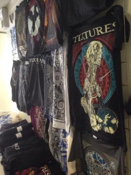
Let’s run through what Visual Amnesia has done so far: album art for Aberrant, Zygnema, Fuzzculture and British tech-metallers Aliases, the 10th anniversary artwork for Textures’ debut album ‘Polars’, tour art for Kryptos’ “Into the Spectral Void” tour, merch artwork for Sahil ‘Demonstealer’ Makhija’s solo album, and even some designs for official Breaking Bad merchandise! No sleep for the wicked, eh?
Absolutely none, and a lot more in the pipeline for August! There are phases when I have slept for 3 – 4 hours a night or not at all. My ability and tolerance for random social chit-chat has drastically reduced because of that. There have been times when I’ve wished for 48 hours in a day.
I think I badly need a port on the back of neck to connect a DARPA slavebot. Just a simple bot with some amount of AI, some chips, basic circuitry, 2 go-pro eyeballs and a pair of arms to reply to emails, shoot pictures of products, catalogue and follow up on things, while I can continue drawing and creating stuff. This is why the mountains are so important for me to visit every once in a while. It helps to maintain some thread of sanity in the midst of all this madness.
Thanks a lot for talking to me, Reuben! We really hope to see your sick design on some new Slipknot merch ASAP. That is, if its supply isn’t kept from our part of the world.
Thanks for having me here, Sairaj! I’m sure no supply will be restricted. If the fans really love it and the numbers add up to make it viable for production post the tour, it could be made available to fans worldwide in due time.
Catch Visual Amnesia’s Slipknot design in the following dates for the ‘Summer’s Last Stand’ tour:
Jul. 31 – Saratoga Springs, N.Y. @ Saratoga Performing Arts Center
Aug. 01 – Wantagh, N.Y. @ Nikon at Jones Beach Theater
Aug. 02 – Hartford, Conn. @ Xfinity Theatre
Aug. 04 – Boston, Mass. @ Xfinity Center
Aug. 05 – Holmdel, N.J. @ PNC Bank Arts Center
Aug. 06 – Pittsburgh, Pa. @ First Niagara Pavilion
Aug. 08 – Toronto, Ontario @ Molson Amphitheater
Aug. 11 – Washington, D.C. @ Jiffy Lube Live
Aug. 12 – Virginia Beach, Va. @ Farm Bureau Live
Aug. 14 – Indianapolis, Ind. @ Klipsch Music Center
Aug. 15 – Chicago, Ill. @ First Midwest Bank Amphitheater
Aug. 16 – St. Louis, Mo. @ Hollywood Casino Amphitheater
Aug. 19 – Denver, Colo. @ Red Rocks Amphitheater
Aug. 21 – Salt Lake City, Utah @ USANA Amphitheater
Aug. 24 – Vancouver, British Columbia @ Rogers Arena
Aug. 26 – Concord, Calif. @ Concord Pavilion
Aug. 28 – Las Vegas, Nev. @ MGM Resort Festival Lot
Aug. 29 – Phoenix, Ariz. @ Ak-Chin Pavilion
Aug. 30 – Albuquerque, N.M. @ Isleta Amphitheater
Sep. 02 – Austin, Texas @ Austin 360 Amphitheater
Sep. 04 – Houston, Texas @ Cynthia Woods Mitchell Pavilion
Sep. 05 – Dallas, Texas @ Gexa Energy Pavilion
Check out more of Visual Amnesia’s art here:
Behance: be.net/VisualAmnesia
Facebook: facebook.com/VisualAmnesia
Twitter: twitter.com/VisualAmnesia
Instagram: instagram.com/VisualAmnesiaOfficial

Wow..didn’t know he’s from India man. Gettn to the Pittsburg show will be getting this..
LikeLike
We hope you do, Eduardo! Feel free to send us a pic of it if you want. 🙂
LikeLike